


How To Scan Color Negative Film With Vuescan
Updated August 10, 2023
Film scanners are designed primarily for scanning color transparencies, which have a much greater density range than a color negative. A full range of tones on a color slide will include areas of totally clear film and areas of almost opaque black. A full range of tones on a negative will include some areas of clear or near clear film in the deepest blacks, but the brightest whites in a properly exposed negative will not be near as dense as the blacks in a slide.
For that reason, negatives will always scan in very flat looking. In addition, color negatives often have terrible color balance right out of the scanner. This is because of the orange base color of the film, which film scanners have a hard time removing. That's ok; we can correct the color later in editing software like Photoshop. Film scans need to be edited in Photoshop or whatever software you like to increase the contrast to normal, and to fix the color balance. My examples below show a few of my photographs with the unedited scan and the final edited version so that you can see just how much needs to be done.
You can also watch a video version of this tutorial on YouTube.

My Scan Settings:
For this tutorial, I used a Nikon LS-50 (Coolscan V) scanner with Vuescan software. The information that I give below should work perfectly for any Nikon Scanner, and should be pretty close with other film scanners. I use Vuescan, rather than Nikon's scanner software, because Nikon stopped supporting Nikon Scan years ago. It tends to be unstable on later versions of PowerPC OS-X and Windows, and does not work at all on the Intel Macs and Apple Silicon Macs. My instructions below are for the Professional Version of Vuescan, using the advanced control set. The Professional Version is required for film scanning; the cheaper versions do not work with film scanners. Vuescan's Mac and Windows versions are identical, so these settings work on either OS.
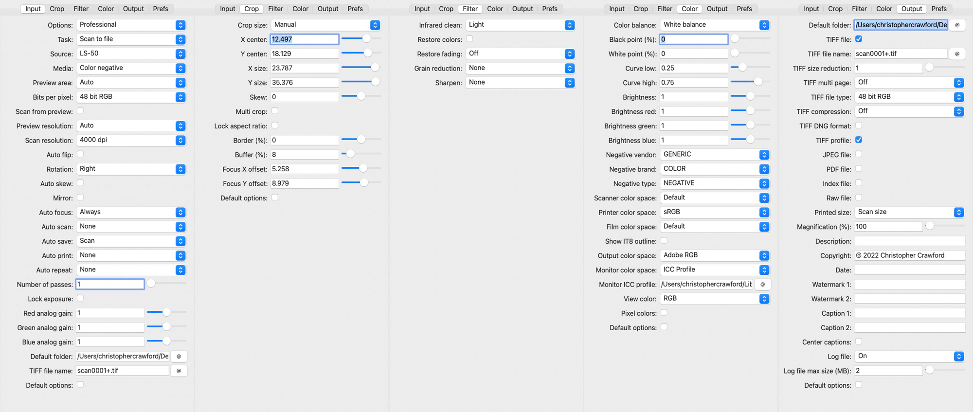
Vuescan is a very powerful program with a lot of settings. The controls are divided into several tabs. These are the settings that I use for scanning color negatives.
Click on the thumbnail to see the settings in a larger image in a new window.
Explaining the settings:
Why I use the settings that I use.
Input Tab
-Options: This should be set to PROFESSIONAL.
-Source: If you have more than one scanner connected to your computer and powered on, you'll need to choose the one that you are using. If your film scanner is the only scanner you have, it will already be chosen by default.
-Media: This tells Vuescan what type of film you're scanning. Choose COLOR NEGATIVE.
-Batch Scanning: This allows scanning more than one image at a time. See my Vuescan Batch Scanning Tutorial for directions. You don't see this option in my screenshots because I was using a film holder that only allows one neg at a time to scan.
-Preview Area: Set this to AUTO.
-Bits Per Pixel: Set this to 48 bit RGB. Don't use the lower 24 bit setting. Color neg scans need a lot of editing for contrast and color. A 24 bit image will fall apart and show color banding when heavily edited.
-Scan From Preview: Leave this unchecked.
-Preview Resolution: Set this to Auto.
-Scan Resolution: Whatever your scanner's highest is. My Nikon does 4000dpi. Don't scan lower thinking you'll make smaller prints. You'll regret this deeply when you decide to make a larger print and have to rescan and redo ALL your post-processing, dodging and burning, retouching, etc.
-Rotation: Leave this alone until after you do the preview scan. If the preview is upside down or turned on its side, change the rotation setting to correct that.
-Auto Flip, Auto Skew, and Mirror: Leave these unchecked.
-Auto Focus: Always (if your scanner offers this...flatbeds don't usually). On the Nikon scanners, you can choose a pont on the image for the autofocus mechanism to lock on to. This should be a detailed area, not a flat tone. If you use autofocus only on the prescan, it may focus on an area without much texture and reduce image sharpness in the final scan.
-Fine Mode: Some Nikon scanners, such as the LS-8000ED, have a bug that produces banding in the final scan. Fine mode increases scan time a bit, but eliminates the banding. I don't think this is needed for the last generation Nikon scanners, like the 9000ED and 5000ED. The option won't show on scanners that don't support it, which is why you don't see it in my screenshots. If it does show for your scanner, use it.
-Number of Passes: Leave this at 1. This is for color slides; there is no benefit to it that I can see with color negs. Slides have higher density than negatives, and this improves dark tone noise in dense slides. It also increases scan times; 2x sampling doubles scan times and 4x quadruples them, so it will waste a lot of time if used for negative scans.
-Lock Exposure: If you are scanning several negatives taken at the same time of the same subject, check this. It ensures that the scanner will scan them all at the same exposure level, making editing in Photoshop much easier.
-Analog Gain: Leave these set at 1.
-Default Folder: Choose the location on your computer where you want Vuescan to save your completed scans.
-Default Options: Leave unchecked; this removes some of the controls!
Filter Tab
-Infrared Clean: Infrared cleaning removes dust and scratches. You should try to keep your negatives scratch-free and you should clean them as well as you can before scanning, but this does work well for those with scratches or embedded dust.
I use the LIGHT setting most of the time. The high settings reduce fine detail resolution, especially the HEAVY setting. The tradeoff is worth it to save a very badly damaged film. The LIGHT setting does not impact image quality.
-Restore Colors/Restore Fading: These are for old faded films. RESTORE FADING fixes loss of contrast and RESTORE COLORS fixes color shifts that happen when color films fade.
-Grain Reduction: I don't use this, it reduces fine image resolution. Film has grain, that is the nature of the medium. Don't like it? Shoot digital!
-Sharpening: I don't use the sharpening built into Vuescan. Sharpen in your image editor (photoshop, lightroom, etc.). The sharpening tools in most editing software is a lot better than what's built into Vuescan.
Crop Tab
Set the Crop Size setting to MANUAL and leave everything else at the default settings.
Color Tab
-Color Balance: For most things, I use the WHITE BALACE setting. You can try the others and see you like one of them better. I found that none of them gave good color from color negative films, but the scans done with the WHITE BALANCE option were easier to color balance in Photoshop.
-White and Black Points: Set white point and black point both at 0% to avoid clipping of highlights and shadows.
-Curves and Brightness Leave these settings at default.
-Negative Vendor, Negative Brand, and Negative Type: These let you choose a specific film that you are scanning. Vendor is the manufacturer (Kodak, Fuji, etc.), Brand is the product line (Portra, Gold, Superia, etc.). Type is for film speeds.
Another option is to choose GENERIC from the Vendor list. Doing so automatically sets the Brand and Type so that the three settings spell out GENERIC COLOR NEGATIVE. This is actually the setting that I recommend. I have found over the years that the GENERIC COLOR NEGATIVE setting actually gives better files that are easier to edit. You would think that choosing the specific film would be better, but my experience is that it is not. Feel free to experiment with the film settings, but I would start with the GENERIC COLOR NEGATIVE setting.
-Scanner Color Space: Leave at DEFAULT.
-Printer Color Space: Ignore this, it is only used for printing directly from Vuescan, and you never want to do that because the scans need editing before they're good enough to print. Do your printing from your image editor (Photoshop, etc.)
-Film Color Space: Leave at DEFAULT.
-Show IT8 Outline: Leave unchecked.
-Output Colorspace: For color scanning, you have a choice of output colorspaces, like sRGB and Adobe RGB(1998). The color gamut of color film is much wider than the sRGB colorspace.
Because it has a wider color gamut than sRGB, and many printers today can reproduce the Adobe RGB color gamut, I use Adobe RGB(1998).
-Monitor Color Space: Set this to ICC PROFILE if you have calibrated your screen using a device like the Datacolor Spyder, Xrite i1 Display, or Calibrite Colorchecker Display. If your screen isn't calibrated, choose sRGB.
-Monitor ICC Profile: This control shows if you have chosen ICC Profile under MONITOR COLOR SPACE. You'll have to manually choose your screen's ICC profile. Most image editing software automatically gets this from the operating system; Vuescan doesn't.
Output Tab
-Default Folder: For some reason, this appears in both the Input tab and the Output tab. If you chose a folder on the Input tab, you don't need to do it again here; the setting carried over from the Input tab.
-File Type: TIFF. Don't use JPEG; jpegs cannot stand much editing without developing nasty image artifacts.
-Tiff compression: None. TIFF Compression is lossless, meaning quality is not reduced, unlike JPEG, which does lose data to reduce size. However, TIFF Compression does not save much file size and makes the file open and save slower.
-Tiff File Type: 48 bit RGB.
-Printed size: Scan Size, 100%. You'll get a file the size of the negative (about 1x1.5 inch for a 35mm neg) at whatever resolution you scanned at. Note that a 1x1.5 inch scan at 4000dpi makes a 13x20 inch print at the normal print resolution of 300 dpi.
-Metadata: The DESCRIPTION, COPYRIGHT, DATE, and CAPTION fields let you type in information about the photo that will be saved in the file's metadata. I don't use it. Photoshop, Lightroom, Capture One, and most other image editing software has much more comprehensive metadata capabilities than those offered in Vuescan.
Prefs Tab
You can leave the stuff in here at default settings.
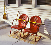
The Final Scan:

As you can see in the screenshot above, the final scan is very flat looking, and the color balance is terrible. Lets open it in Photoshop and fix that.
By applying some curves adjustments we can increase the contrast and fix the color balance. I have a Curves Tutorial if you need help with this powerful image editing tool.
After color and contrast correction. A beautiful photo!
Color negative scans require much more editing after the scan than scans of slide film do. This is because film scanners are made for the wide density range of a color transparency. Negatives, BW or Color, have a lower density range, and are lower in contrast than transparencies are. This makes them scan in looking very flat. The orange mask on the color negative is a major problem. It is there for correcting color balance for printing on traditional chemical-process color papers. It isn't needed for scanning, and in fact it makes color correcting scans much harder. Its presence is why the uncorrected scans look so blue.
More Examples:
Once again, scan is very flat looking, and the color balance is very blue.

After color and contrast correction, the image looks great.
The knowledge that I am sharing took many years of study and practice to attain. If you find it valuable, please donate through my Paypal button below. My creative work is how I support myself and my son. Thank you!
©2023 Christopher Crawford
260-437-8990

